Designing OnTime V2 with Claude Design
Von Sander Hahn am 17.09.2026
When I planned OnTime V2, my planning doc listed Figma as the design tool and I set aside 40 to 60 hours for design alone. In the end I didn’t open Figma at all. I designed the whole redesign in Claude Design. This article covers why I switched, how it went and where the tool reached its limits.
Why not Figma or Canva?
All three big design tools now have AI. Figma puts it inside a professional canvas and coding agents can even design directly in your files. Canva AI 2.0 creates layered, editable designs from a conversation. It’s great for marketing material, but it isn’t built for app UI.
For OnTime, the question was simple: who is the designer on this project? I’m a solo developer. I had a design system in Figma to build on but I wanted something new. Claude Design can read images and design or even codebases and extract its colors, typography and components, so it was an easy choice.
The start
V1 already had parts I wanted to keep, like the week calendar with drag-to-create entries and the live recorder. A new look wasn’t the only reason I decided to design a new UI. It also needed to fit a much bigger app around that core: workspaces, roles, invoices and bank reconciliation.
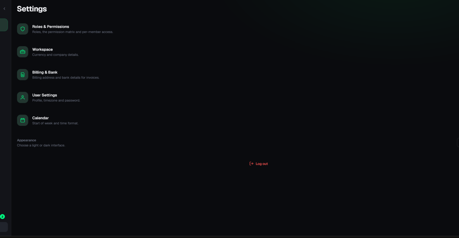
So I didn’t start with a blank prompt but I gave Claude Design my previous design and it built a design system from them. Then I asked for the new screens. It made the iteration faster but it also needed a lot of help finding the correct design. It was by far not a single-prompt-execution and it took a lot of trial and error to get to a useable state.
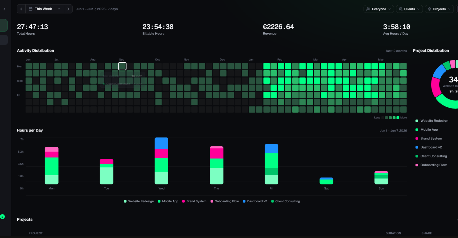
- Overview: V1’s overview had bar and pie charts. For V2, the overview got more animated stat cards, an activity heatmap and a project split.
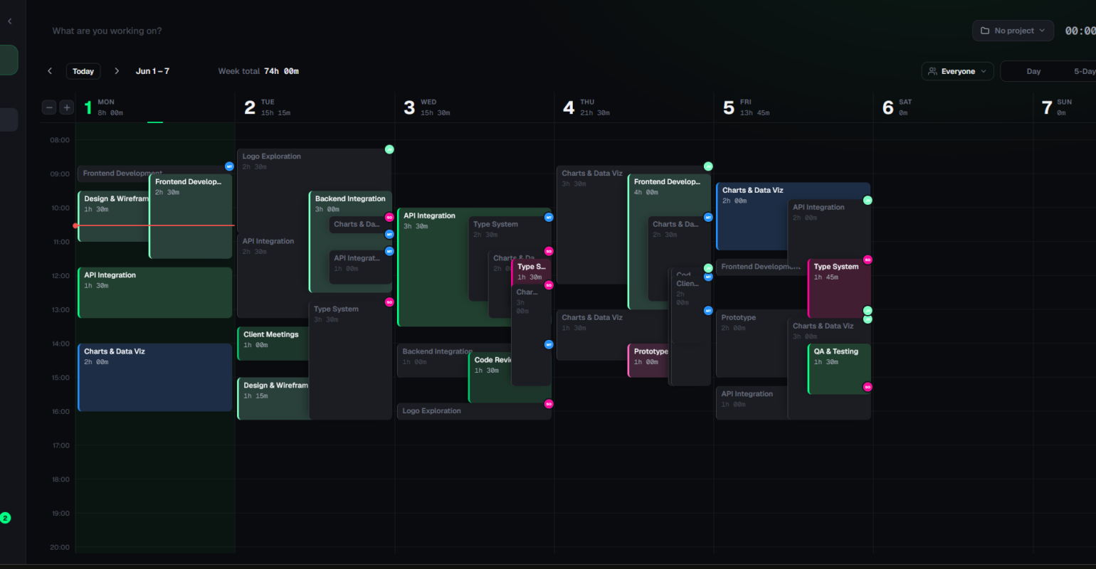
- Calendar: This screen changed the least. The work here was mostly styling it to the new design and adding a new entry design so it’s more compatible for multi-user support.
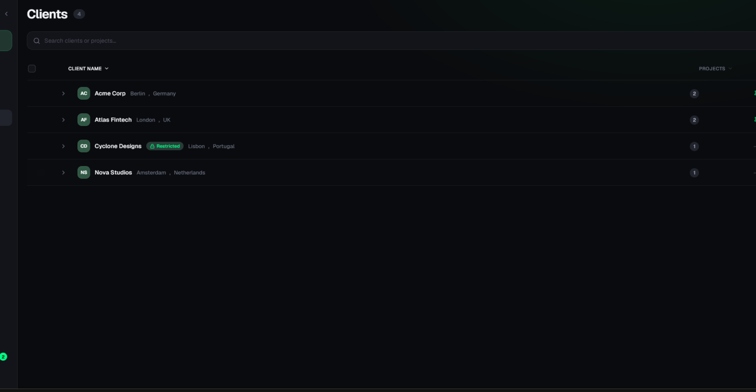
- Table pages: The table pages consist (well) just pages, so the main thing was to add the new design layout and archivable entries with a switch.
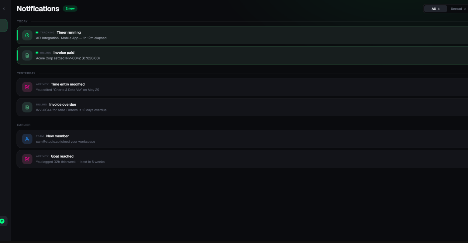
- Notifications: Funnily enough, this page was the hardest to design because the plain table design didn’t feel right. I decided to use cards for each notification with views for read and unread messages.
- Invoices and payment review: These screens were new, so there was nothing from V1 to copy. But since it was also one of the last pages I got to, it was easier to find a fitting design.
From design to code
The implementation took the longest to do because I rebuilt everything by hand in React. Claude Design lets you export your website as code but without any framework. I could’ve moved around it to let Claude generate everything but I wanted to do the programming side on my own. The mobile shell sits behind its own build flag in the app so switching the flag for testing on desktop was easy to do.
What worked, what didn’t
What worked:
- Exploring was nearly free. I tried a lot of directions for the design and the different pages before settling on one.
- The design system stayed mostly consistent across screens without me policing it.
What didn’t:
- The spacing not always stayed consistent.
- Not explaining your idea in detail leads to disappointing results.
- Design may look generic.
Takeaway
For a solo developer, the design phase used to mean switching tools: design in Figma, then translate it into code by hand. With Claude Design, but now you can make Claude do the heavy lifting. Even though I decided to implement the design myself in code, it designing of the actual website was way faster and I was able to test a lot of different directions. The decisions stayed with me: what gets attention first, what stays from V1, what a finished page should look like. Claude did the designing and I made the design decisions.