
Building a Personal Planning App: From Interface Idea to Data-Driven iOS Prototype
Von Melanie Maier am 16.09.2026
Software projects often begin with a feature list. This one began with a feeling: everyday planning tools are everywhere, and yet personal organization still often feels fragmented. Calendars live in one place, tasks in another, reminders somewhere else, and the mental work of connecting them is left to the user. The goal of this project was not simply to build another productivity app, but to explore how a planning interface could feel more coherent, calmer, and closer to the way people actually think about their days.
The app is still in development, and many of its final ideas are intentionally not public yet. For that reason, this article does not reveal the complete product concept or all planned functionality. Instead, it focuses on the development process so far: how the project evolved from a SwiftUI interface prototype into a more structured iOS application with custom data models, persistent storage, reusable components, and first steps toward external calendar integration.
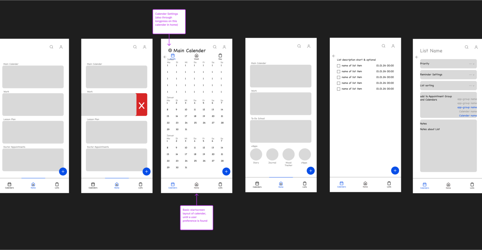
At the beginning, the project was mostly visual and exploratory. The first question was not “Which database should this use?” or “How should synchronization work?” but “What should this feel like on a phone?” Since the app is meant to be used frequently and quickly, the interface had to be approachable without becoming decorative for its own sake. SwiftUI was a natural choice because it allowed fast iteration on layout, navigation, state, and component structure. Early work focused on core screens: a home view, overview pages, detail pages, and small reusable interface elements that could later become the visual language of the app.
One of the first lessons was that a planning app becomes complex faster than expected. Even if the user-facing idea sounds simple, the underlying structures are not. A calendar item is not just a title and a date. It may have a start and end time, an all-day state, a location, notes, tags, a source, an editability status, and possibly a connection to another system. A task is also more than a checkbox. It can belong to a list, have a due date, include notes, be marked as important, be connected to a reminder, or later need rules for rescheduling. Reminders introduce yet another rhythm, because they are not exactly tasks and not exactly events. They sit somewhere between intention and interruption.
Because of that, the project moved relatively early from screen-building into model-building. Separate structures were created for calendars, events, lists, tasks, reminders, external sources, and calendar connections. This was an important shift. Instead of letting the UI define the data informally, the data model started to define what the interface could reliably express. Each object needed an identity, needed to be encodable, and needed to be flexible enough for future features without becoming vague. This part of the process was less visually exciting than building screens, but it made the rest of the application much more stable.
The central data layer became an observable store that holds the current calendars, events, lists, tasks, reminders, and external connections. This store is used throughout the SwiftUI views via environment injection, which keeps the individual screens relatively focused. A home screen can ask for visible calendars, upcoming events, or incomplete tasks without owning all the logic itself. Detail pages can receive a selected object and rely on shared update and delete methods. This architecture is still lightweight, but it creates a clear boundary between application state and presentation.
A useful turning point was implementing filtering and derived data. Once there were multiple entities in the store, the app needed answers to questions such as: Which events belong to this calendar? Which tasks belong to this list? Which events are upcoming? Which tasks are incomplete and still relevant? These may sound like small helper functions, but they changed how the app could be built. Instead of each screen duplicating filtering code, the store became the place where the application’s understanding of its data lived. That made the UI easier to read and helped reduce inconsistencies between screens.
Another major step was persistence. In early prototypes, sample data is enough. It helps with layout and gives the app something to display. But a planning app cannot remain a prototype for long if data disappears every time it restarts. The current version stores a snapshot of the application data as JSON in the app’s documents directory. The snapshot includes the core collections and can be loaded again when the app starts. The saving process also keeps a backup file, so the app has a fallback if the primary file cannot be read.
This persistence system is intentionally simple. It is not yet a large database layer, and that is partly deliberate. At this stage, JSON-based persistence makes the app easier to inspect, debug, and evolve. The project is still changing, and a lighter storage approach gives more freedom while the domain model continues to settle. At the same time, the persistence layer is separated from the store, so replacing or extending it later would not require rewriting the entire UI. This is one of the recurring themes of the project: avoid overengineering too early, but create enough structure that future changes do not become painful.
Autosave introduced its own design questions. A planning app should not require the user to manually save after every small change. The current approach listens for changes across the main collections and saves the current snapshot after a short debounce. This means the app can react naturally to edits while avoiding excessive file writes. It also means the development process had to account for state changes that are not user edits, such as loading persisted data at launch. Small flags and guard conditions became necessary to prevent the app from immediately saving over freshly loaded state or treating internal setup as user activity.
The interface also evolved significantly during this phase. The app now has a clearer structure of pages and components: overview views, detail views, card components, a navigation bar, headers, picker panels, floating action controls, and shared form elements. This componentization was not just about cleaner code. It also helped the app develop a consistent interaction style. Planning tools can easily become cluttered because they contain many object types and many possible actions. Reusable components make it easier to keep the experience predictable.
One example is the creation flow. Adding something new should not feel like entering a completely different app. The current implementation uses a shared sheet for creating or editing different item types. It supports modes for events, tasks, and reminders, with separate draft objects and validation. This draft-based approach is important because forms are temporary by nature. A user can open a sheet, make changes, switch context, cancel, or save. Keeping draft state separate from the saved model avoids accidental writes and makes validation clearer.
The form system also revealed how much detail is hidden inside “simple” input. Dates, times, optional fields, associations with calendars or lists, tags, icons, and reminder relationships all require careful handling. If these concerns are spread directly across the view code, the form quickly becomes difficult to maintain. By separating drafts, form rows, picker state, and saving logic, the app gained a structure that can grow without turning every new field into a cascade of fragile changes.
Design-wise, the project has been moving toward a custom visual identity rather than relying entirely on default iOS components. Custom fonts, color assets, icons, rounded shapes, and card components give the app a more personal tone. This is not only aesthetic. For a planning tool, visual hierarchy matters. The user should be able to distinguish calendars, lists, upcoming items, actions, and details quickly. Colors and cards are not decoration here; they carry information and help reduce cognitive load.
At the same time, building a custom interface in SwiftUI requires restraint. It is tempting to make every component unique, especially in a project that has a strong visual direction. But the more custom the interface becomes, the more responsibility the developer takes on for spacing, accessibility, responsiveness, and consistency. This has been one of the practical challenges of the project: finding the balance between a distinctive interface and a maintainable one. The current component structure is an attempt to make that balance explicit.
The most technically demanding part so far has been external calendar integration. Local planning data is one thing; synchronizing with external systems is another. The app now contains service layers for Apple Calendar and Google Calendar, as well as a synchronization service that imports events into the app’s own model. This required thinking about authorization, external identifiers, read-only versus editable sources, date ranges, mapping between API objects and local models, and what should happen when external events change or disappear.
Apple Calendar integration uses EventKit and must deal with platform-specific permission states. On newer iOS versions, access levels are more precise, so the app has to request and verify the correct kind of calendar access. The service can list available calendars and load events within a selected time range. These events are then mapped into the app’s internal event model, preserving information such as title, location, notes, URL, start and end date, all-day status, external identity, and sync metadata.
Google Calendar integration is different because it goes through Google Sign-In and web API requests. This required handling OAuth scopes, restoring previous sign-in sessions, refreshing access tokens, making authenticated requests, decoding calendar lists and event responses, and converting Google’s date formats into local date values. All-day events need special handling because calendar APIs often represent them differently from timed events. These are the kinds of details that are easy to underestimate before implementation begins.
The synchronization layer sits above the individual provider services. It loops through configured external calendar connections, loads events for each connection, imports them, tracks which external IDs were seen, updates sync timestamps, and reports failures. The store then upserts imported events instead of blindly appending them. This prevents duplicates and creates a place to handle conflicts. If a local event has pending changes and an external version arrives, the app can mark the situation as a conflict rather than silently overwriting data. Even though the full synchronization story is not finished, the current structure already reflects a key principle: user data should be treated carefully.
This was one of the biggest conceptual lessons of the project. Synchronization is not just a technical feature. It is a trust feature. If users put their plans into an app, they need confidence that the app will not lose, duplicate, or unexpectedly modify important information. That means the code has to represent uncertainty. It needs states such as local-only, synced, pending local changes, conflict, or deleted externally. These states are not glamorous, but they are what make the difference between a demo and a tool people might rely on.
Another lesson was that the app’s “domain” became clearer through implementation. At first, calendars, lists, tasks, and reminders may seem like familiar categories. But once they are modeled together, their relationships become more interesting. Some items belong to collections. Some can be associated with time. Some can be completed, others can only pass. Some are imported from outside and should not be edited locally. Some may later need richer rules. The development process has therefore been partly technical and partly analytical: understanding what each object means in the system.
The current prototype also includes several navigation paths: a home view with upcoming information, calendar overviews and detail views, list overviews and detail views, event and task detail screens, and setup flows. This breadth created a new kind of challenge. Once the app had more than one or two screens, consistency became harder. A change in the model might affect a card, a detail page, a form, and a preview all at once. This is where reusable view components started to pay off. They made the app feel less like a set of separate screens and more like one coherent product.
The project is still in an active development stage. There are visible signs of ongoing refactoring: components have been moved into clearer folders, global elements have been separated from list-specific and calendar-specific components, and some older file paths are being replaced by a more organized structure. This is a normal and healthy part of development. Early prototypes often grow organically. At some point, the structure has to catch up with the idea. The important part is not to make the architecture perfect immediately, but to keep improving it when the project’s shape becomes clearer.
Looking back, the development so far can be described in phases. The first phase was interface exploration: building enough screens to understand the experience. The second phase was domain modeling: defining the objects the app actually needs. The third phase was state and persistence: making the app remember and update data reliably. The fourth phase was integration: connecting the local world of the app with external calendar systems. The current phase is consolidation: refining components, improving flows, reducing duplication, and preparing the project for more advanced behavior.
For a student or early-stage software project, this progression is valuable because it shows how practical software development rarely follows a perfectly linear plan. The app did not begin with a complete architecture diagram and then simply fill in the pieces. Instead, each implementation step revealed the next architectural need. A form revealed the need for drafts. External calendars revealed the need for source metadata and sync states. Autosave revealed the need to distinguish loading from editing. Reusable cards revealed the need for stronger model relationships. The architecture emerged through contact with the problem.
There is also a broader lesson about building products that are not ready to be fully disclosed. It can be difficult to talk about a project publicly when the most exciting parts are still private. But not every development story has to reveal the final product. It is possible to discuss the engineering process, the technical decisions, the mistakes avoided, and the problems encountered without giving away the complete concept. In some ways, this is more useful for an informatics audience. The real value is not only in what the app will eventually do, but in how the system is being shaped to make that possible.
The next steps will likely focus on stability, refinement, and careful expansion. The persistence system will need to remain reliable as the data model grows. Synchronization will need more testing, especially around conflicts and edge cases. The interface will need continued polishing across different device sizes and user scenarios. Some flows that currently exist as early implementations will need to become more robust. And as the app moves closer to a publishable version, privacy, permissions, error handling, and user trust will become even more important.
What makes this project interesting is that it sits at the intersection of design, data modeling, and everyday behavior. A planning app is not just a technical container for events and tasks. It is a tool that asks to be invited into a user’s routine. That creates a high bar: the app has to be useful without being noisy, structured without being rigid, and personal without becoming confusing. Reaching that balance takes iteration.
So far, the development has already moved beyond a simple prototype. The app has a working SwiftUI foundation, a growing design system, structured models, persistent local data, reusable creation flows, and initial external calendar synchronization. More importantly, it has a clearer sense of direction. The final product is not ready to be revealed yet, but the development process has already shown what kind of challenge this is: not merely building screens, but building a coherent planning environment one careful layer at a time.