
Designing a Calm Planning Experience: From Wireframes to a Coherent Visual Identity
Von Melanie Maier am 16.09.2026
Software projects are often described through architecture, data models, and technical milestones. Interface design tends to appear later in that story, as if it were simply the visible layer added once the important work is complete. During the development of this personal planning app, I experienced almost the opposite. The design process helped define how the product should behave, what kind of relationship it should have with its users, and which parts needed to remain simple as the underlying system became more complex.
The project is still in development, and its name, complete concept, and current interface are intentionally not public yet. This article therefore does not present a product reveal. Instead, it focuses on the design process between March and August 2026: how the interface developed from functional wireframes into a more coherent visual system, how collaboration influenced the result, and how repeated feedback changed my understanding of clarity, accessibility, and visual identity.
The app was developed during the second semester of the Master Interactive Media program. Its technical foundation is an iOS application written in Swift, but this project was mainly concerned with screen design and brand development. The public scope covers the basic screens already named in the development article: home, calendar and list overviews, related detail pages, and forms for calendar entries, list items, and reminders.
Beginning with structure
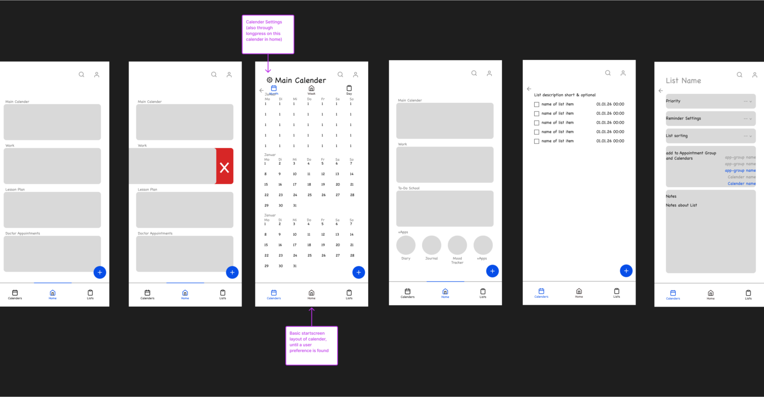
The first design phase consisted of wireframes for these core functions. At that point, the goal was not to decide on colors, fonts, or icon styles. The wireframes were used to understand information hierarchy and navigation: What should appear first on the home screen? How much information belongs in an overview? When does an item need its own detail page? Which actions should be immediately available, and which can remain one level deeper?
This phase was deliberately simple. Boxes represented content areas, placeholder text represented labels, and navigation elements were reduced to their basic purpose. It also exposed how quickly a planning interface can become crowded. Even the basic screens combine dates, titles, statuses, categories, actions, navigation, and secondary information. The home screen needed to offer orientation, overviews had to support scanning, and forms required a more guided rhythm.
One important lesson from this stage was that visual hierarchy begins before visual styling. If the structure does not make priorities clear, stronger colors and larger headings only make the confusion more visible. The early wireframes therefore became a reference throughout the later process. Whenever a refined screen started to feel overloaded, I could return to the basic structure and ask whether the added visual elements were supporting the original purpose or competing with it.
From wireframes to the first design screens
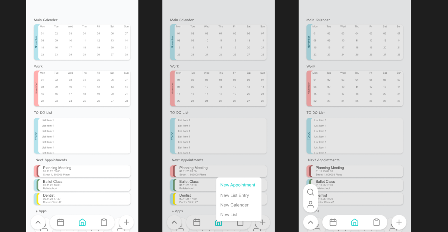
The next phase translated the wireframes into the first designed screens. This was the point where the project began to develop a personality. Typography, rounded forms, color relationships, icons, cards, borders, and spacing were introduced. The interface was meant to feel personal and approachable, so the first visual direction leaned strongly toward a playful style.
At first, this seemed appropriate. Planning is a daily and personal activity, and a playful interface offered a contrast to the strict appearance of many productivity tools. However, this phase also demonstrated that friendliness and playfulness are not the same thing. As more screens were added, decorative forms, multiple outlines, different icon styles, and expressive typography created too many points of attention. What worked as an isolated detail did not always work as part of a growing system.
The first design screens were therefore valuable precisely because they were not final. They made the intended personality visible, but they also revealed where that personality needed more discipline. The project had reached the stage where individual screens could no longer be evaluated only as attractive compositions. They had to work as one product.
Collaboration as a design process
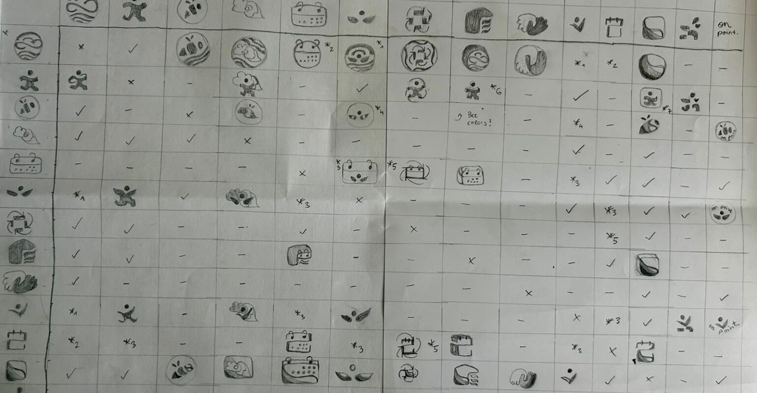
During the visual development, I worked with a graphic design student who was responsible for developing the logo and the custom icons and who also proposed directions for the color concept. She is not named here, but her role in the process was substantial. I acted as the stakeholder for the application: I explained the intended character and requirements, reviewed ideas and intermediate states, and made decisions about how the graphic work should connect to the interface.
The collaboration was not organized as a single briefing followed by a finished delivery. She shared sketches, variants, and intermediate states, and we discussed which qualities felt appropriate while the interface itself was evolving. I often approached an element through function: Is the icon understandable? Can the asset be used consistently in Swift? Her perspective added questions of visual rhythm, shape language, balance, and recognition.
The logo and icons became important anchors for the emerging identity. Their development introduced more organic forms into a product that still needed a clear structure. This tension became one of the most useful ideas in the project: the interface could be calm and organized without becoming cold, and it could retain distinctive, playful details without allowing every component to become expressive.
The color proposals connected the graphic identity to the screen design, but applying a palette to an interface is different from presenting it in a visual study. Colors that look balanced together may not provide enough contrast for text, and a shade that works in an illustration may be too prominent across a large card. The collaboration provided the visual material, while the interface work tested it under practical conditions.
Feedback from recurring test users
Alongside the design collaboration, I repeatedly showed the screens to approximately five test users. The group was not statistically representative; its value came from continuity. The same people saw several stages and could react to changes over time.
Two issues appeared repeatedly: text was sometimes too small, and the contrast between text and background colors was sometimes too weak. The feedback revealed the difference between designing at full size on a computer and using the result on a phone. A composition can look spacious in a design tool while becoming tiring at actual device size. Because users need to identify dates, items, categories, and actions quickly, readability is part of the core interaction rather than an accessibility layer added later.
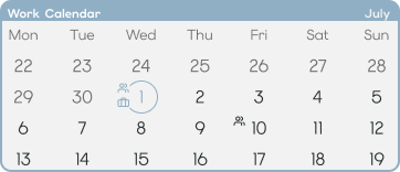
In response, font sizes were reconsidered, text colors were strengthened, and some relationships between foreground and background were simplified. The process also made me more cautious about using color to create hierarchy. If several shades are close in brightness, they may create a harmonious palette but fail to establish a useful reading order. Contrast has to work both aesthetically and functionally.
The users also identified screens that felt too busy even when every individual element was understandable. Familiarity reduces perceived complexity: after working on a screen for a long time, I already know where to look, while a test user does not. The central question gradually changed from whether the design looked friendly to whether it helped users feel oriented.
Moving from playful to calm
The strongest change between the first designs and the refined screens was the overall design language. The earlier versions were visibly more playful. Over time, the interface became quieter, clearer, and more structured. This did not mean removing all personality. Instead, playful qualities were concentrated in selected places, particularly in organic forms and custom icon details, while the main layout became more restrained.
Color was the most challenging part of this transition. The palette had to communicate warmth and individuality without reducing legibility or making the interface visually heavy. Several versions were needed before the relationship between light surfaces, darker functional elements, and accent colors felt balanced. The final direction is less about using many colors and more about giving each color a clear role.
The refinement also affected borders, cards, spacing, and typography. Reducing unnecessary boundaries allowed alignment to do more of the organizational work. Headings, secondary information, form labels, and actionable text received clearer roles. The typeface could support personality, but size, weight, spacing, and contrast had to support usability.
The same principle applied to iconography. Custom icons helped preserve the organic and personal character of the project, but an icon family also needs internal rules. Stroke weight, level of detail, filled and outlined states, and the relationship between icon and label all affect consistency. The icon work therefore became more than a collection of illustrations. It became the beginning of a visual grammar.
Designing a system rather than isolated screens
By the refinement stage, the screen set included the home screen, calendar and list overviews, calendar and list detail pages, and the add forms for calendar entries, list items, and reminders. Although this remains only the basic functional scope, it is already broad enough to expose inconsistencies. A heading that works on the home screen may occupy too much space in a form. A card that works for an upcoming event may not work for a list item. A navigation control that feels obvious on an overview may be ambiguous on a detail page.
This encouraged a more systematic approach. Instead of adjusting every screen independently, I began to think in reusable decisions: spacing intervals, text roles, card behavior, icon states, color functions, and recurring navigation patterns. This is also where the design process connected directly to the Swift implementation. Reusable SwiftUI components are easier to create when the visual rules are clear. Conversely, implementing a component across several screens quickly reveals where a design rule is too specific to one mock-up.
The relationship between design and development was iterative. Screens informed the component structure, and implementation challenged the screens. Small differences are easy to draw but harder to justify when they require separate code paths. Variation therefore had to become intentional.
The brand book developed alongside this consolidation. It brought together the values, personality, tone of voice, typography, colors, icon principles, and product experience guidelines that had emerged through the previous months. Creating it forced decisions that individual screens could postpone and turned visual preferences into shared rules.
The brand identity can be summarized through a few qualities: clear, empathetic, and reliable. These qualities function as design criteria rather than promotional adjectives. Clarity requires an understandable hierarchy. Empathy means avoiding language and interactions that create unnecessary pressure. Reliability includes predictable navigation, legible states, and careful treatment of user data. A distinctive visual style is useful only when it supports these qualities.
A cautious look toward adaptive interfaces
One future direction being explored is an adaptive interface. It has not yet been implemented, and the details remain intentionally broad. The basic idea is that the presentation could respond to screen size, accessibility preferences, or explicitly chosen modes instead of showing the same density at all times.
However, adaptation creates a design risk. An interface that changes too freely can become difficult to learn and may reduce trust. Important navigation should remain predictable, and users should understand why a view has changed. Suggestions should remain reversible, and the full information should still be accessible. For this project, the most promising principle is therefore not an interface that constantly rearranges itself, but a stable structure with carefully limited adaptive areas.
If adaptation is intended to reduce cognitive load, it must not create new uncertainty. Sufficient contrast, consistent controls, and user agency remain more important than novelty. The underlying system has to be stable first.
What I learned from the process
Looking back at the period from March to August 2026, the design developed through three broad stages. The first established the functional structure through wireframes. The second introduced a strong but comparatively playful visual direction. The third refined that direction through collaboration, implementation, and feedback until the interface became calmer and more coherent.
The process showed me that refinement is not simply the act of making a design more polished. It often requires changing the criteria by which the design is judged. Early in the project, I focused strongly on whether the screens had personality. Later, I evaluated whether that personality supported orientation, readability, and trust. The final direction is not less designed than the first one. It is more selective about where design becomes visible.
Recurring feedback also proved valuable even with a small test group. The most important findings were fundamental issues such as text size and contrast. Repetition made them harder to dismiss as individual preference and turned them into priorities. The design collaboration added a dialogue between graphic expression and interaction requirements rather than a simple handover between disciplines.
The current design should not be understood as a finished public product. More testing will be necessary on real devices and across different display settings. Accessibility checks must become continuous rather than a final review, and the adaptive interface idea will require careful prototyping.
For now, the most important result is a clearer design foundation. The project has moved from a collection of functional screens toward a recognizable system with shared principles. It can remain personal without becoming visually noisy, and it can become more structured without losing its organic character.
The complete application is not ready to be revealed, but the development process already offers a useful lesson: a calm interface is not created by simply removing elements or choosing quiet colors. It is created by deciding what deserves attention, testing whether users can recognize it, and refining every visual choice until personality and clarity support each other.